Visual exploration of multivariate time series data in R using ggplot
February 21, 2013 – 11:19 am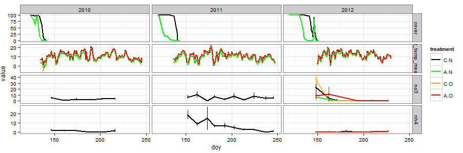
I want to share some data manipulation and graphing techniques I have found useful for making flexible visual comparisons of time series data in R. These techniques can be pieced together from the documentation of the R packages and various online forums but sometimes it’s helpful to have a fully integrated example based on real data, so that’s what I’m presenting here.
The problem at hand is that we have dozens of variables from our Arctic experiment that we have measured over the same time period, in our case three summer field seasons. We want to be able to compare subsets of the variables or even all of the variables on the same temporal axis so that we can see which events in the data line up temporally.
I took three main steps: (1) melt the data frames that contain all the variables into data frames with a uniform column structure; (2) bind all variables into a giant data frame using rbind; and (3) use the mapping and paneling features of ggplot2 to draw plots.
Step 1: The melt function
This function is a really nice and generally useful technique to have in your munging arsenal. Basically it reformats your data into a “long” format in which there is only one column called ‘value’ that contains all numeric response variable data and then adds a column called ‘variable’ listing the variable name.
The melt function has a complementary function cast that goes in the reverse and casts your melted data frame in whatever “wide” format you want. That’s great for making paired comparisons, though it is not needed for what I’m doing here. Together these are a great way to reshape your data frames to whatever format you need and are a lot better than the confusing reshape function.
The example I’ll show can be run on your own machine after loading the data:
load(url(paste("http://anthony.darrouzet-nardi.net/",

 "data/snowmelt_project_example.Rdata",sep='')))
Melt the data frames containing diverse data sets, in this case soil cores (destructive harvests=dh), air temperature, and snow cover. The date is in day of year format (the doy variable).
require(reshape2)

dh.m <- melt(dh.blog,id=c("year","doy","block","treatment"))
airtemp.m <-   melt(airtemp.blog,id.vars=c("year","doy",
 "block","treatment"), measure.vars = "air_temp_mean",na.rm=T)
snowcover.m <- melt(snowcover.blog,id.vars=c("year","doy",
 "block","treatment"))
By default it will melt all columns that are not id.vars into a single column. To select only certain columns, identify them as measure.vars.
Step 2: rbind
This is the easiest step, typically one line of code with maybe a few modifications to the resulting data frame. The order of the data can be relevant for ease of graphing them in a particular order, but there are always ways to change that sort of thing downstream as well. Make sure before binding that the data frames to be stitched together have identical columns and column names (colnames).
snow_project <- rbind(snowcover.m, airtemp.m, dh.m)
snow_project$treatment <- ordered(snow_project$treatment,
 c("C.N","A.N","C.O","A.O"))
Step 3: Graph with ggplot
Let's say we want to compare ammonium and nitrate from the soil cores with air temperature and soil cover. That's all the data I uploaded for the example, but for our actual project there are way more variables. This is the graph shown at the top of the post. Click it for larger size.
require(ggplot2)

require(Hmisc)

theme_set(theme_bw())

ggplot(subset(snow_project,

  (variable=="nh4"|variable=="no3"|

  variable=="air_temp_mean"|variable=="cover")),

  aes(doy, value,col=treatment)) +

 geom_line(stat = "summary", fun.y = "mean",lwd=1) +

 stat_summary(fun.data = "mean_cl_normal",conf.int=0.68,lwd=.2) +

 scale_color_manual(values=c("black","green","orange","red")) +

 facet_grid(variable~year, scales="free_y")

#this takes a sec to print due to the error bar calcs
First I subset the massive snow_project data frame to extract the variables I am interested in graphing. The subset can be left out if I want to graph everything all at once. For my current project, I have been having R draw a massive 110×30 inch pdf.
You want to take advantage of (1) the panel system in facet_grid along with (2) what data visualizer Jacques Bertin calls "retinal variables." These are the colors, shapes, symbols, textures etc that you use to encode additional data dimensions. Between retinal variables and panels you can show a lot of variables in the same graphic.
In the example, treatment is color coded using the col argument in the main ggplot input function. If you had another variable you needed to show, the shape argument is probably the next most useful after color. Use the show.pch() function in the Hmisc package to see what shapes are easily available.
After deciding what you want each panel to look like, the facet_grid function divides your plots up into separate panels by variable allowing easy access to any kind of comparison we want. The formula input is vertical~horizontal for panel structure. In this case we have variables stacked on one another and horizontal separation by year. The scales="free_y" is essential for this approach because it allows your different variables to each have their own axis scale. For some variables, we might prefer to plot them in the same panel (like say soil and air temperature). In that case, pull variable out of the facet_grid function and put it in col or shape.
This series of steps works great for time series data, but the techniques in the three steps can be useful for other non-time series data as well.
Sorry, comments for this entry are closed at this time.