Showing data underlying bar graphs
March 11, 2009 – 5:05 pmA few years ago, I posted on Edward Tufte’s message board advocating that people show the data that underlie their bar graphs. Here’s the thread. My post included this graphic meant to demonstrate the double standard for continuous data where the data is clearly shown on a scatterplot, vs. categorical data that is most often portrayed using “dynamite plots.”
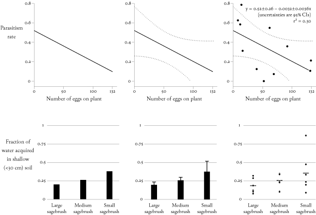
The basic argument is that showing the underlying data (points for a small sample, or boxplots for a larger one) allows readers to see the range, distribution, central tendency and its uncertainty, sample size, and outliers. On the other hand, the dynamite plot shows only the central tendency and its supposed uncertainty by way of the standard error, which has its own questionable assumptions and other issues.
Probably aided by the endorsement that the graphic originally got from Edward Tufte, I’ve now seen it picked up in a couple other places by statisticians who are likely trying to make the same point about the double standard. Here’s a slide show by Dr. Frank Harrell that includes the graphic and here’s a handout on data analysis made by Dr. Rafe Donahue.
I should take this opportunity to point out that I am certainly not the originator of the idea that bar graphs hide information instead of showing them. For example, Dr. William Magnusson has authored a number of critiques along these lines, such as this one in the Bulletin of the Ecological Society of America (may require subscription), in which his Figure 2 makes a similar point but without the discussion of the blatant double standard between continous and categorical x-axis variables.
It’s been fun to see this graphic float around and I hope even more people use it! Even better, maybe people will stop hiding their data in bar graphs.
Sorry, comments for this entry are closed at this time.