Explaining p-values intuitively
November 25, 2015 – 10:11 amThere is an interesting post on 538 today showing that most scientists cannot explain intuitively what a p-value really tells you. This does not surprise me, but may surprise some who still think p-values are an acceptable analysis framework. Some can spout the definition but the definition is pretty useless because it relies on epistemologically problematic ideas like separating events into black and white categories of “due to random chance” or “not due to random chance.”
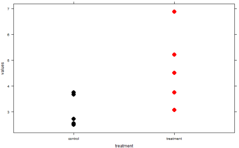
That said p-values are not devoid of information and the way to interpret them is to imagine what they show about a confidence interval. If your p-value is exactly equal to 0.05, your 95% confidence interval for the parameter of interest will exactly touch zero on one end (or whatever your “null hypothesized” value is). Here’s an example of a t-test where p is really close to 0.05. Note the very close link between the p-value being just under 0.05 (yay, it’s “significant!”) and the confidence interval being barely constrained to not crossing zero. The data underlying this particular test is shown in the graph.
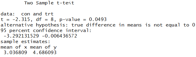
So, the p-value is useful insofar as it gives you a clue about what the confidence interval is for your effect size. Confidence intervals are easily human-understandable (e.g., 95% chance the true value is in this range given assumptions of calculation method) while p-values are not. Why not just report the confidence interval instead? That is a rhetorical question.
To get a better sense of p-values for yourself, here’s some code you can fiddle with. Watch the confidence interval and p-value output from the t-test alongside the graph while tweaking the sample size, variability, and true difference between samples. It would be cool to make this runnable and tweakable right here on the website but that’s maybe a project for another day.
n = 5 # sample size
sd = 1 # variability
con <- rnorm(n, sd=sd) + 3
trt <- rnorm(n, sd=sd) + 5 # true difference is 5-3 = 2
t.test(con, trt, var.equal=T)
d <- data.frame(values=c(con, trt), treatment=
  factor(rep(c("control", "treatment"), ea=n)))
xyplot(values~treatment, d, pch=16, cex=2,
  col = rep(c("black", "red"), ea=n))
This might be made even more clear by looking at a paired or “one sample t-test” type of example where you can literally see that 95/100 of the paired differences from many simulations will be within the confidence interval and that, again, that confidence interval will just barely graze 0 when p=0.05.
Along these lines of asking scientists to explain commonly used statistics, I saw in a stats class the professor ask students to draw a standard deviation on a set of points like the ones in the above graph. (This was a radically different kind of stats class and the first place that clued me in to the problems with the p-value paradigm). It was intriguing and instructive to see how difficult it was to interpret a basic concept like standard deviation intuitively. Not to leave you hanging, ~68% of points should fall within the SD.
Sorry, comments for this entry are closed at this time.